LinkedIn Ads for continuing education: the creative sets your CPL, not the bid
A human face, square format and a CTA inside the image. The three changes that move cost per lead before you touch the campaign.
Is your graduate program campaign spending without a single qualified lead? The reflex is to raise the bid or widen the audience. Almost always the problem comes earlier: in the creative. On LinkedIn the user decides in under a second whether your ad speaks to their career or is corporate noise. They make that call by looking at the image, not by reading the copy. Here I break down, with academic evidence and a real piece from a project management certification, which creative elements sustain conversion and which ones hold it back.
1. A human face is a credibility shortcut
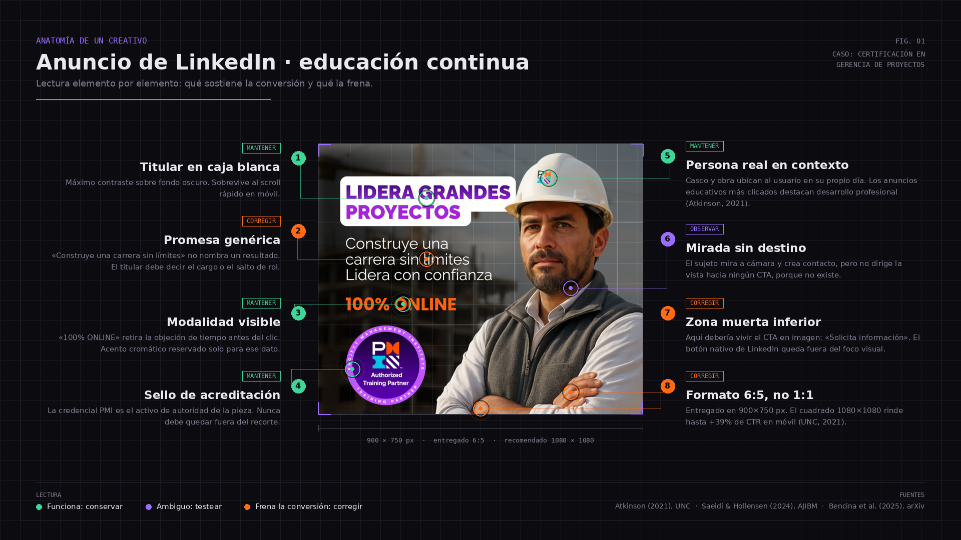
The person in the image serves a measurable function: it tells the user "this is what someone like you looks like after getting certified". An engineer with a hard hat on site communicates in 300 milliseconds what three lines of copy cannot.
Atkinson's (2021) analysis of 520 education ads on LinkedIn points in that direction:
The most effective ads on LinkedIn highlight professional development and employability benefits. Summary of Atkinson, M. (2021). Higher Education Advertising on LinkedIn: A Quantitative Content Analysis of the Most-Clicked Ads Across One Year. University of North Carolina at Chapel Hill.
A real person is the natural vehicle for that message. Two nuances I defend in every design review: a real person, not polished stock, because the perfect stock image triggers the "this is an ad" filter and sinks CTR; and a work context, not a neutral portrait, because the hard hat, the site or the control room place the user inside their own Tuesday morning.
What about minimalist design with no humans? It works for consumer brands with prior recognition. In continuing education, where someone is weighing a career change worth thousands of dollars, people and credentials matter more than visual cleanliness.
2. Format is a performance decision
In a mobile feed the square takes up more screen height than the rectangle. More screen, more attention per impression, more clicks for the same spend.
The figure circulating from the UNC study (2021):
Square design (1080x1080) generates +39% CTR on mobile versus rectangular. Summary of the University of North Carolina study, 2021, cited in the original proposal.
The implication is uncomfortable for many design teams: a piece delivered at 900x750 px is not square. It gets cropped, loses hierarchy, and the accreditation seal, often the most persuasive asset in the ad, ends up mutilated.
Operating rule: design at 1080x1080 from the first file. Never adapt afterwards. Cropping always eats the CTA or the credential.
3. The CTA lives inside the image
LinkedIn places its button outside the dominant visual area. If the creative does not say what to do, the user who stopped at the image will not do it.
"100% ONLINE" describes the product. It is missing the next step, "Request information", and it is missing the real benefit: not get certified, but lead larger-scale projects with an international credential.
The structure I use for the text inside the piece: professional outcome in one line (the role they reach, not the course they take), proof (accreditation seal or a one-line testimonial), low friction (format and duration) and an explicit CTA (verb plus immediacy).
4. Target by job title, not by interest
LinkedIn is the only platform where job title is data declared and updated by the user themselves. Targeting by "interest in project management" means paying a premium price for Meta-grade targeting.
For a project management certification: job title (Project Manager, Project Engineer, Site Coordinator, Site Supervisor), industry (construction, IT, mining, energy), 3 to 10 years of seniority (enough to need the credential, not so much that they already have it), and local market location and language with creative in the local language.
Saeidi and Hollensen (2024) remind us of something paid campaigns tend to ignore:
To maximize impact, it is recommended to combine institutional profile optimization, quality content, engagement, targeted outreach and paid ads. Summary of Saeidi, S. and Hollensen, S. (2024). Digital Marketing on LinkedIn: In-Depth Strategies for Lead Generation. American Journal of Industrial and Business Management, 14(5), 655 to 668.
The ad does not operate in a vacuum. Whoever clicks checks the institutional page before leaving their data. If that page is dead, your CPL rises for a reason Ads Manager will never show you.
5. Check attribution before killing a creative
An ad that "does not convert" may be assisting conversions that last click never credits to it. LinkedIn is developing AI-based attribution models for exactly that reason:
LiDDA is a data-driven attribution model for understanding the user journey and optimizing campaigns. Summary of Bencina, J. et al. (2025). LiDDA: Data Driven Attribution at LinkedIn. arXiv.
Before pausing a variant, review the attribution window, view-through and volume. Killing a creative with 12 conversions is not optimizing: it is reacting to noise.
The test that actually produces learning
With a single creative there is no learning, there is luck. The minimum viable test is three variants with the same audience and the same budget over three weeks.
Variant A: PMI credential front and center. Hypothesis: accreditation lowers perceived risk.
Variant B: career advancement ("lead larger-scale projects"). Hypothesis: the career benefit beats the credential on CTR.
Variant C: alumni testimonial. Hypothesis: social proof beats both on form completion rate.
Decide with cost per qualified lead, not with CTR.
References
Atkinson, M. (2021). Higher Education Advertising on LinkedIn: A Quantitative Content Analysis of the Most-Clicked Ads Across One Year. University of North Carolina at Chapel Hill.
Saeidi, S. and Hollensen, S. (2024). Digital Marketing on LinkedIn: In-Depth Strategies for Lead Generation. American Journal of Industrial and Business Management, 14(5), 655 to 668.
Bencina, J. et al. (2025). LiDDA: Data Driven Attribution at LinkedIn. arXiv.
Frequently Asked Questions
- Real people or minimalist designs in education ads?
- Real people in a work context for cold acquisition. Minimalism performs in retargeting, where the brand is already in the user's head and you only need to remind them of the offer.
- Which image format works best on LinkedIn Ads?
- Square 1080x1080 for the mobile feed. Available evidence reports double-digit CTR differences versus rectangular in education ads.
- Should I show the certificate or the professional benefit?
- Both, with hierarchy: benefit as the headline, credential as the supporting seal. The certificate alone does not sell. The benefit without proof does not convince.
- How much budget do I need to validate a creative?
- Enough to accumulate conversions that let you decide with confidence. In continuing education, with a high CPL, that rarely happens in less than two or three weeks of continuous exposure.
Conclusion
Your ad is not competing to be pretty. It is competing to be recognizable in 300 milliseconds. A real person in context. Square format. Professional benefit as the headline. Credential as proof. And a CTA that does not depend on LinkedIn's button. Everything else, bids, lookalikes and budget tweaks, optimizes on top of a baseline the creative already set. Want an annotated breakdown of your own creative? Send me your current piece and I will send back the map of what to keep, what to test and what to fix.